From bits to pieces: How design systems improve collaboration
For a design system to do its job properly, every stakeholder of the service needs to utilise, update and understand it. Otherwise, designers will work in their bubble of ideal elements wrapped in a perfect system — while the actual website will look completely different.
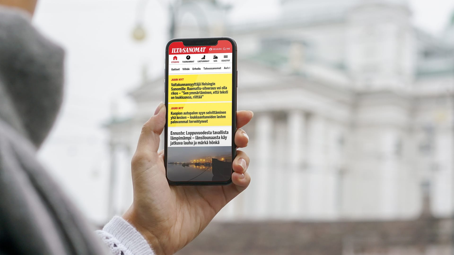
Large digital services with a variety of content running on multiple platforms often risk having an inconsistent visual appearance. This is partly because parts of the service were built at different times by different people, and partly because design decisions get lost along the path from the initial idea to the final implementation. Consequently, parts of a service can look different depending on when they were built or where they appear. To solve this problem, design teams rely on design systems.
Ideally, a design system will help create a consistent visual appearance by breaking interface components down into their smallest elements, which are then reused in multiple components and contexts. For example, on a news page, a teaser component, displaying a piece of news will consist of a headline, image, introductory sentence, and a bookmarking icon. From this element, the font family and spacing, can be reused e.g. for displaying the same news item in a list of recommendations. Moreover, all elements of this teaser component will have margins or paddings which can be reused for spacing similar elements elsewhere on the page. New components can then be built based on these smallest elements.
Moreover, once an element is changed, all components that use the same elements are automatically updated. In other words, when we change the colour of a bookmarking icon in the teaser, every component that uses the same icon will change its colour. Thereby, designers and developers can ensure a consistent visual appearance across all applications and websites of a service.
But for a design system to do its job properly, every stakeholder of the service needs to utilise, update and understand it. Otherwise, designers will work in their bubble of ideal elements wrapped in a perfect system — while the actual website will look completely different.
In this blog post, I will explain the process we used to integrate a design system into our ways of working at Finland’s largest tabloid newspaper, Ilta-Sanomat.
Collecting the bits
As we set out to implement a design system, Ilta-Sanomat had three style guides in use. One was the style guide used for the last website renewal, the second contained groups of selected layouts, and the third comprised a small library of interface components as reusable symbols. Essentially, these guides mostly just catalogued past versions of the future, because the design and development process was out of sync.
In contrast to the latest interface component library, the inspection of the website revealed hundreds of different shades of grey or red, as well as a multitude of font sizes, font colours and background colours. The missing link between the design library and the coded styles resulted in this ambivalence of the design library and the final website.
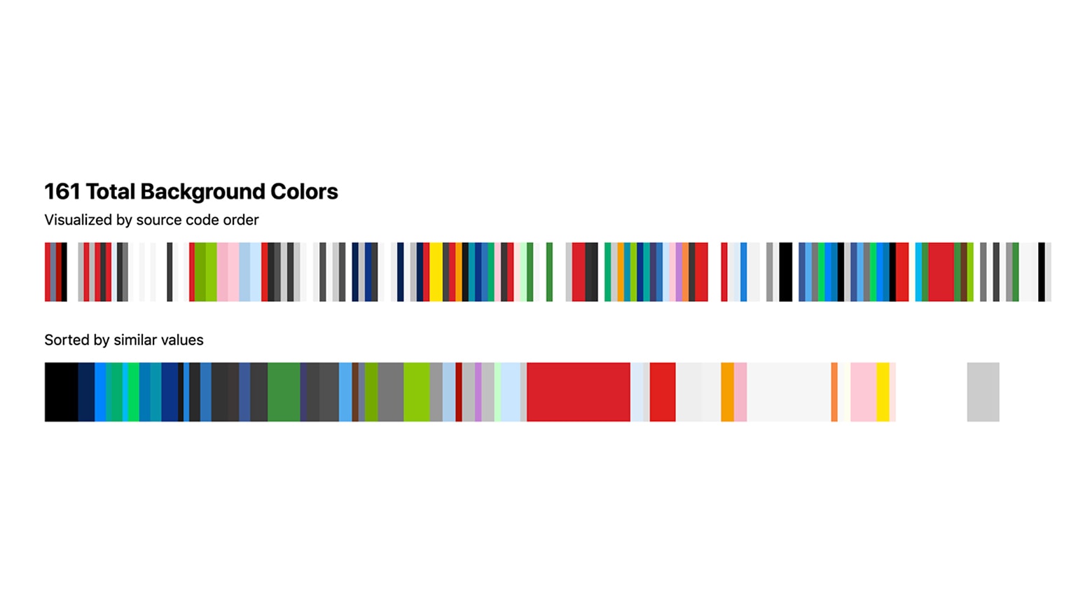 Background colors defined in the CSS of the website
The problem lay in the process. Once designers finished a new component, they added it to the current design library and moved on to the next issue. Meanwhile, the new component would become a ticket in the development backlog. After developers had resolved the ticket, the final implementation was released without further discussion with the original designer. As the designers followed their style guides and the developers followed pre-existing styles from the CSS, the result did not reflect the initial design. Consequently, for every new element or layout, we had to decide whether we wanted to be consistent with other parts of the website, or continue with the improved design.
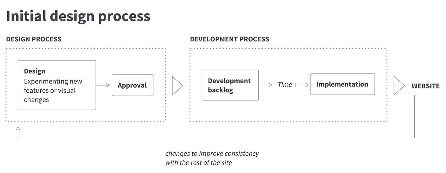 The initial design and development process
Building pieces
When working on a large website, designers and developers tend to focus on the parts they are currently working on. But a website is more than just a list of components – a user perceives a website as a single unit by moving and scrolling through its pages. Therefore, the website should be designed and built as one entity.
To better account for this, I printed the entire website on a long strip of paper. Seeing a website in one piece instead of one screen at a time enables us to discern any inconsistencies, e.g. in headline sizes or colours. Afterwards, I placed cutouts of the elements from the print on a piece of paper. This overview became our first design system, which was based on the actual components of the site.
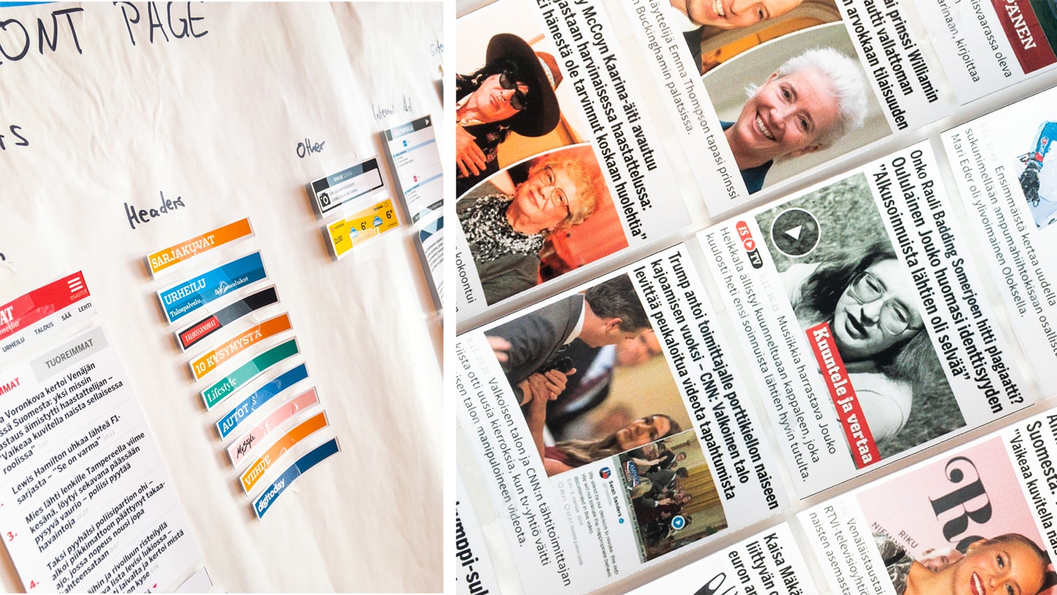 The first design system on paper
In the subsequent design renewal process, we re-evaluated all elements on the front page of the website. During this process, we printed more websites to discern design patterns and best practices. And finally, after a two-week design sprint, we started to define the design system.
To build the system, we applied and extended the components we had developed during the sprint on all other pages, such as article pages and section pages.
Parallel to the design renewal, we evaluated methods to link the design and development processes. We settled on Storybook as a tool to display individual components as they appear on the website, and Abstract for version control of the design system. Similarly to other design systems, we defined common styles, such as font sizes, margins and colours, components like buttons and the search bar, as well as sample layouts for site-specific components like lists and teasers. Together with the development team, we documented all these styles and components both in Abstract and Storybook. Through this collaboration, we ensured that developers understood the logic of the design styles, and that designers were aware of the components defined in Storybook.
After this collaborative process, both developers and designers could actively collaborate in the creation of components. For example, when designers applied an incorrect font size, developers would ask why we had diverged from the agreed type scale, instead of defining the mistake as an exception to the rule.
Keeping the pieces together
Design systems only work when all stakeholders are committed to using them. I already explained the pains of working with a design library that differs from the styles of the website, and the same risk persists with design systems. Even when components are documented and new elements follow defined styles, everyday reality can disrupt the system. To prevent this pitfall, we introduced a “design review” phase into the development process. In practice, this means that developers and designers have to talk before publishing a design-related issue on the website.
Additionally, we included our design tasks to the same issue tracking environment on Jira that the developers were already using. And during the design process, we started to differentiate between a master design system project and work-in-progress files. Per the new process, designers will only update the master file after both designers and developers have approved the final implementation. Through these three steps, we ensured the design system stays up-to-date and in sync with the final elements in the Storybook.
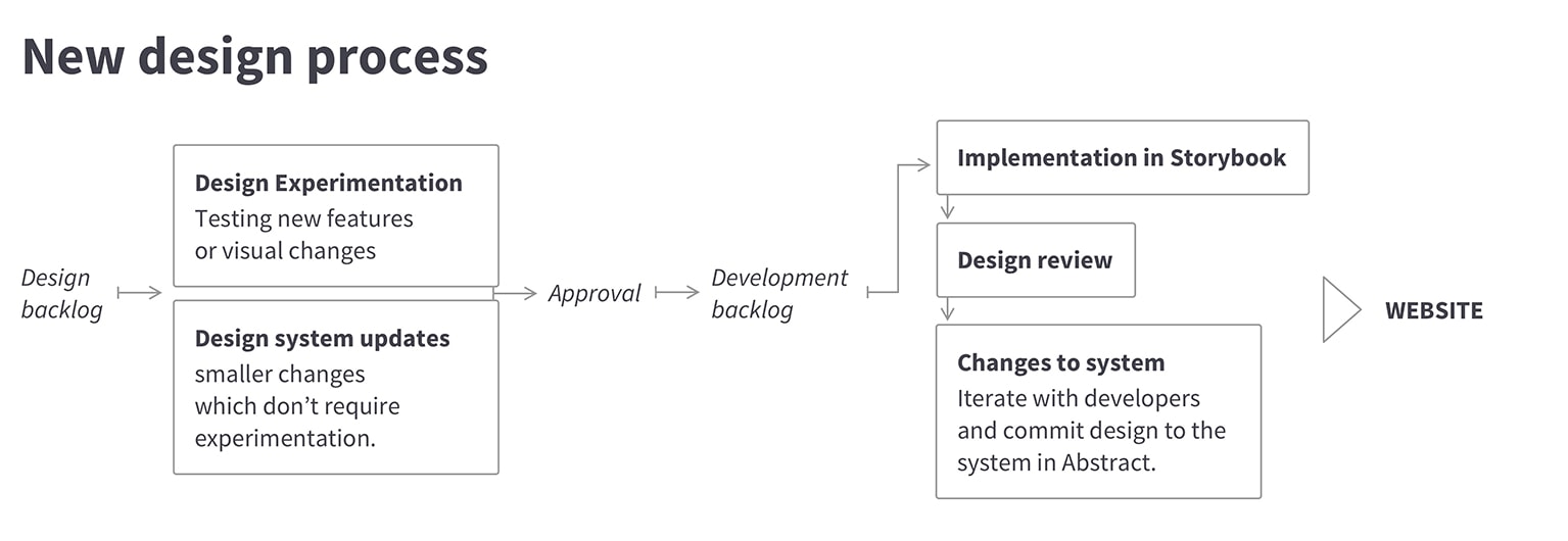 The new design process
From pieces to value creation
From my experience, a successful design system does not depend on its structure or the tools used to maintain it. What matters most is that designers and developers speak the same language. When designers talk about captions, list entries, brand colours, and headlines, the developers understand the reference. In return, designers understand that technically not all lists are lists just because they look the same.
There are many benefits in documenting styles, elements and components into a reusable system that is accessible to all stakeholders. But in our case, the design system first and foremost improved collaboration across disciplines inside the entire team. Thanks to this process, the development team can now implement new features and changes faster than before, because every component uses predefined styles. And on the other hand, the design team can focus on creating the best possible experience for every user instead of running after broken font styles caused by lack of communication.
 The new Ilta-Sanomat front page
 Kilian KottmeierSenior designer

