Finavia: Taking air travel accessibility to new heights
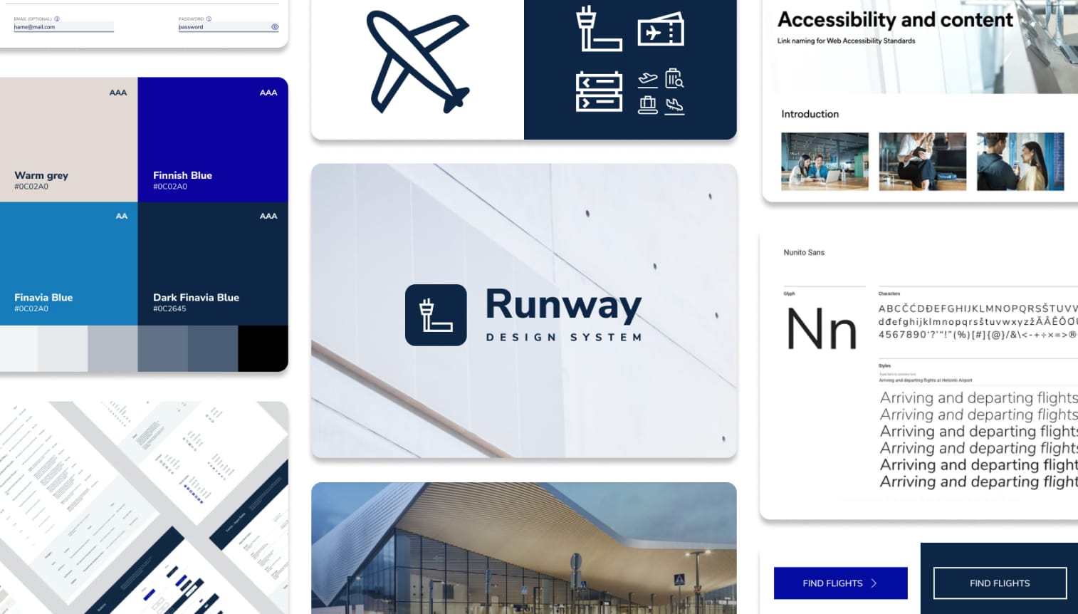
The accessibility of digital services is just as important as physical accessibility in air travel, where users face multiple touchpoints along the journey. To support airport operator Finavia in its mission to make travel smooth for everyone, Futurice created Runway DS, a design system to turn the omnichannel offering into an inclusive and coherent user experience. The design system aims for WCAG Level AA accessibility and scales across channels, speeding up both design and development work.
The challenge
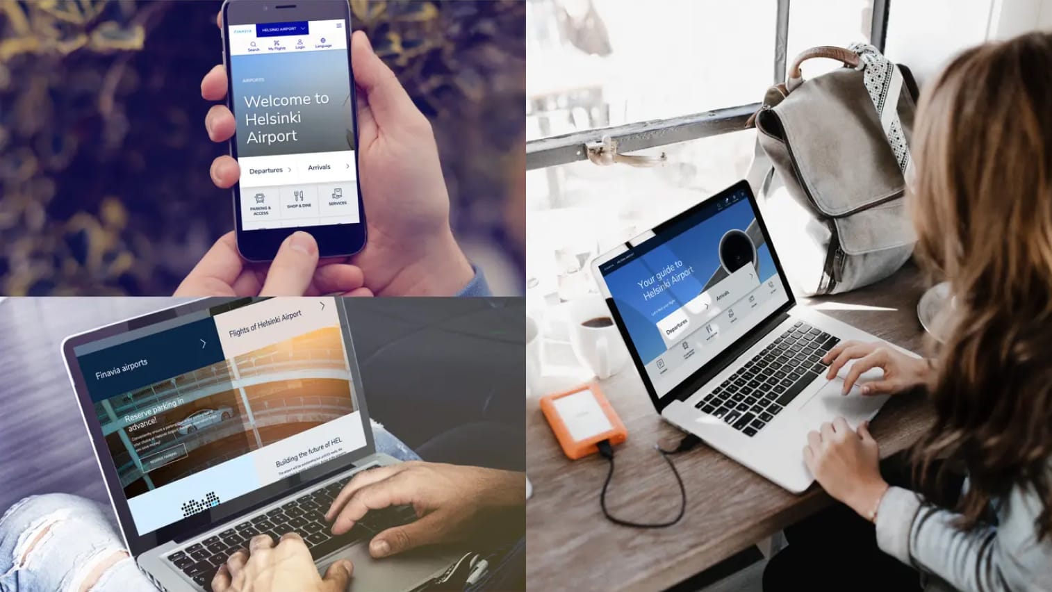
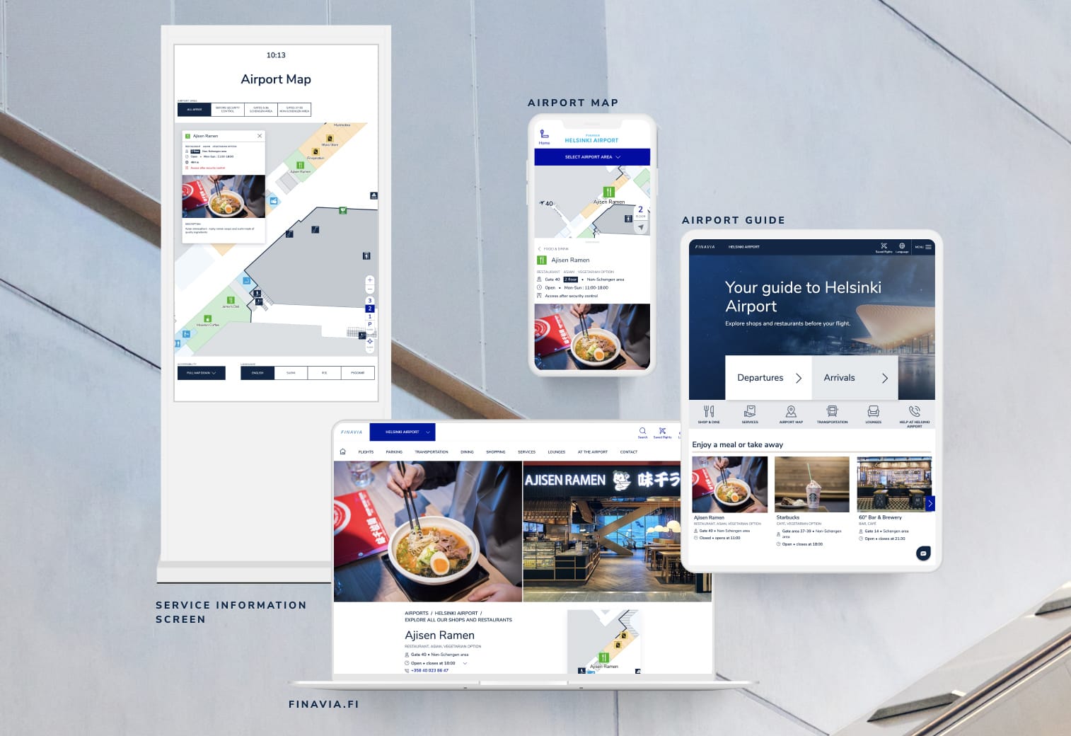
Runway Design System was created to sharpen Finavia’s customer promise to provide a smooth travelling experience at its 20 airports in Finland. With a reputation as one of the most innovative and customer-centric airport operators in the world, the bar was set high from the start. Finavia needed a design system that would cover multiple digital service touchpoints – the website, airport guide, map, service info screens, and internal admin tool – to provide user friendly, accessible experiences for everyone.
Our approach
Our aim was to make Runway DS stand out in terms of accessibility, scalability, and maintenance. Far too often, accessibility is just an add-on layer in design systems, but in the case of Runway DS, it’s the foundation for everything from UI components, form validation and product flows to accessibility guidelines for content creation.
The Runway DS follows the Web Content Accessibility Guidelines (WCAG), an international accessibility standard developed by the World Wide Web Consortium (W3C) Web Accessibility Initiative (WAI). While Level A indicates minimum compliance, AA goes further towards making websites more usable and understandable for everyone. With a strong focus on users, it covers for example the following aspects:
- Color contrast definitions
- Text alternatives or similar solutions for images that convey meaning
- Consistent navigation elements
- Accurate labels, errors and success states for forms
- Status updates conveyable through a screen reader
- A logical order of headings
- Usability across different screen and text sizes
What we did
Accessibility is a mindset that emphasizes understanding and better serving the needs of everyone regardless of their skills, backgrounds or impairments. The project began by performing an accessibility audit of the Finavia website. Based on detailed and practical tests, shortcomings in accessibility were outlined in fine detail.
Next, we proceeded with the design and development of new visuals, components, and features. Our designer and developer collaboration emphasized constant sparring and learning from each other. We used atomic design methods to ensure the design would implement and scale when reusing components across multiple channels. The common goal was to keep the brand experience consistent and accessible at every touchpoint by building and adding only the necessary amount of components to meet design needs. Design and development were considered equally important: Finavia’s customer and user expectations are met with design thinking, and functionality stems from quality code. Components and design tokens, i.e. values such as spacing, color, typography, object styles and so on, are managed and made available to developers using SASS.
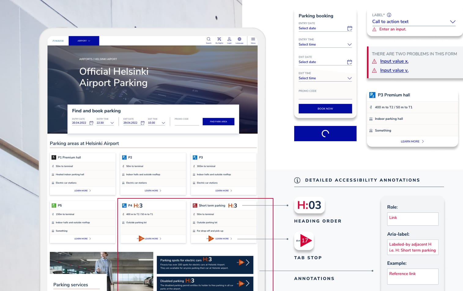
Runway DS starts where many design systems end, covering the color palette, typography, iconography, buttons, input fields, combo boxes, as well as notifications. Moreover, some of the Finavia brand’s identity elements such as typography and colors were adjusted to meet the accessibility standard in digital channels. All components are reusable at every touchpoint, – from the website to physical service info screens, for example. In addition, we created accessibility guidelines which enable and support content creators in producing screen reader accessible content for the website, for example. The design system is also presented as a shared style library for developers. Accessibility annotations, e.g. header levels, tab stops, and ARIA attributes, were added to the designs in order to improve collaboration between developers and designers.
The custom made style library is further enhanced with third-party JavaScript libraries to address the accessibility needs of dynamic content. Any code changes or additions are automatically Lighthouse tested for accessibility. Developers from different consultancies can maintain the style definitions, and the source code is in a shared GitHub repository. Zeplin displays the correct design tokens, with few plugins. Additional accessibility annotations, specifically the header level markings, tab stops, and ARIA attributes, were added to the designs in Runway DS in order to improve collaboration between developers and designers in the design handover phase, ensuring a high level of quality.
While all new changes are tested automatically, manual testing is also performed, for example with screen readers. This manual testing is an important step, since it isn’t possible to automatically verify that all accessibility guidelines are met.
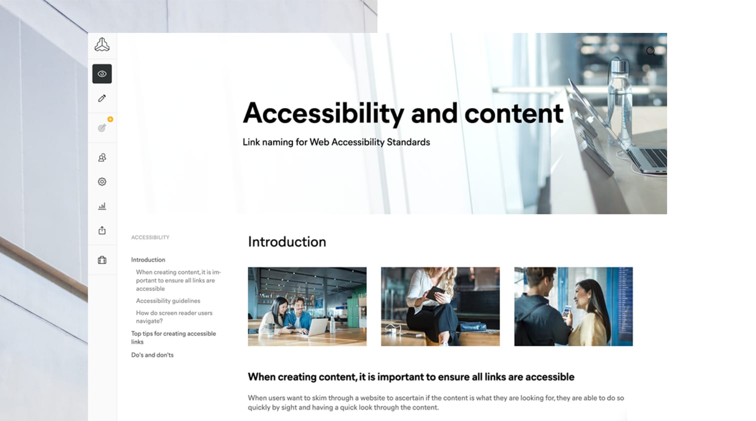
Why it matters
The state-of-the-art Runway DS enables a highly inclusive airport experience for everyone. The design system, with its WCAG Level AA accessibility standard, means a huge improvement for maintaining Finavia's seamless omnichannel customer journey. It also strengthens Finavia’s brand presence, taking it a step closer towards the company’s vision and strategy.
The developers and designers working with Finavia now have a practical starting point for keeping digital services coherent and accessible. In addition, onboarding new employees is easy. The benefits were already proven during the project, which was implemented efficiently. RunwayDS also scales up to accommodate any upcoming needs and can be integrated with additional services, enabling new business for Finavia and its partners.

Working with Futurice is truly a collaborative and fulfilling experience. They have consistently proposed well-thought-out solutions that have helped us achieve our business goals while also keeping our customers at the forefront. Their ability to work together with various stakeholders makes planning and execution seamless and effective.
Want to know more?
Get in touch
Wherever you are on your digital journey, our services and experts can help you along the way. Let's get talking!
